ADORN Design System
ADORN provides shared UI components, interaction patterns, and visual standards across web and mobile. The system helps teams work consistently, reduces duplicated work, and creates a single reference for designers and developers.
Problem
Before ADORN, components and patterns diverged across platforms, creating inconsistencies and slowing development. Designers and engineers lacked a single reference point for UI standards.
Solution
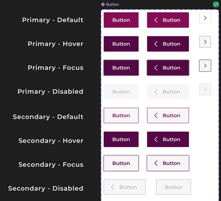
I collaborated with design to document components and guidelines in Figma and Notion. I implemented spacing, typography, and reusable UI components—including buttons, inputs, and carousels—to establish a consistent, reusable framework for web and mobile.
Impact
- Figma Dev Mode integration improved engineering velocity by roughly 20%, with no added headcount, by keeping design tokens and component props in sync instead of engineers rebuilding one-offs from screenshots.
- Built a reusable PlanCard primitive that shipped across three product surfaces (cancel flow, membership overview, plan-change confirmation) within weeks of the first implementation.
- Consolidated duplicate carousel implementations into a single ADORN AutoscrollCarousel, removing a redundant one-off component and reducing overall code.